Saturday, August 17, 2013
Stage two portraiture
Stage two portrait with blending some shadows and value gradation and a bit of highlights. Still under-painting which is why I haven't messed with the eyelids and lash details yet nor the lips, hair, beard, or brow.
Monday, August 12, 2013
Thursday, July 18, 2013
Reflections
This Is a watercolor/gauche and ink painting I did for my senior art show of a teardrop rippling a pool reflecting a saddened persons face. I really enjoy combining water mediums with pen and ink for the added texture and comic art quality it can bring out of a normally painterly effect from the paint alone. I used no reference photos and did no sketching when working on this piece. I began panting the forms only by blocking in color, and shapes, and then went back with the ink to define some outlines as wells as the ripples to offset the softness of the face.
Pagliacci - Warped Self Image
I had to complete a conté crayon self portrait sketch in under one hour for one of my advanced drawing classes. The self portrait had to convey to the viewer our self image, and inner hidden feelings. It was supposed to show others what we felt like we looked like on the outside. At the time is was going through a lot and was pretty depressed, so I identified with the crying clown Pagliacci. To the real world, all of my friends, and family I came across as the classic nice guy. I was happy, supportive/caring, funny, fun to be around, social, and seemed well put together. Needless to say I always felt completely transparent like others could see my deep inner secrets, my failures, my bad deeds, my sins, and I felt so exposed all of the time. We all wear masks to help us hide the things that make us most vulnerable I suppose from time to time.
Portraiture - quick sketching
Here are some examples of quick portrait studies I completed back at John Tyler Community College, and while in Art (Honors Level) at Manchester High School.
John - Classmate
Amerie - Classmate
Self portrait - duality
All of the above portraits were completed in a timed exercise in under 5 minutes using willow and vine charcoal only. Witch a model for reference. The clock was started and it was "pencils" down (rather i say "sticks") when the alarm buzzer sounded. I loved how Mrs Diana Detamore punches me to see form and shape rather than preconceived visuals I "thought" I was seeing. This pushed me to become so well versed in facial emotion and expressions as well as not afraid of breaking the mold on proportions, scale, angle, and subject matter.
Self Portrait - VA Congressional Statewide Student Art-show 1st Place Winner
These last two were completed in Senior Art Honors class at Manchester High. The first of Jennifer is a "Da Vinci" style light study where the form is created by collecting and recording only information on the placement of highlights and reflective light areas. It forces the artist to see the forms of gradation and not tangible outlines and special references. The last portrait was painstakingly created partially from mirror posing, and from memory as well as a reference photo of my eyes nose and mouth cropped down as the only outside tool.
Tuesday, June 25, 2013
Random sketching delights
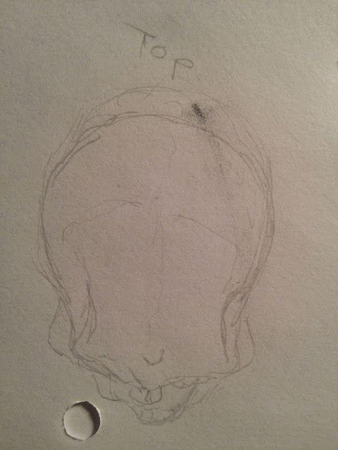
Here are some recent sketches I completed for fun and just to get back into a habit of working with pencil again. I am going to be finishing up the edits for issue 2 of my comic/graphic novel script ad have every intention of beginning to tackle my rough page layouts again ASAP. I will still be working on my paintings in the down time and have every intention of posting a third and possible final stage to the lightning painting. In this collection of sketches we have some attempts at Don draper from MadMen, Superman, a female detective type, and a piece of a prisoner praying. As well as some brief studies of a skull. Hope you enjoy there will be more to come.
Thursday, May 30, 2013
Ride the Lightning
After taking a break from my most recent panting (Goodbye Blue Skies), I decided it was time to begin the second phase of the process. I have known for some time that it was going to be a chaotic storm with crimson skies, set against a dark, and foreboding background of black. This second stage of the painting process was dedicated to me working on additional color values for my darkest areas while smoothing out the bridge between highlights. The next mission for this session was to block in the overall appearance, and placement of the heavy lightning storm.
To start the night off right, and set the mood for this menacing oil piece, what could be better than a good ole pandora station composed of the Big 4 Gods of Metal? If you are unfamiliar they are as follows (and in my order of preference) Megadeth, Metallica, Slayer, and Anthrax. We can also include some odd balls I have spiced in for my brutal metal master mix including: Iron Maiden, Motörhead, and Judas Priest.
I began prepping my materials as I always do, and while I ate a bit of muffin, (sharing some with my painting buddy Harper -- a tortoise shell cat); I looked over reference images of various types/colors of lightning. What I find most odd and somewhat eerily coincidental is that all the music from my mix this evening referred to storms, electricity, or darkness of some variety. As I began to paint I was introduced to my canvas by the most epic and appropriate "Call of Cthulhu" - Metallica, then as I started working on the darkened areas, Iron Maiden began to play "Fear of the Dark". Perhaps even more bizarre is the matter of me hearing "Ride the Lightning" as I worked on striking the electric bolts to the cloudscape.
Fellow artist friends and blog followers, I would love the feedback on the last colors/placement of the lightning as well as the changes to the highlights, and shading of the piece from this second session. One thing I did have trouble with is trying a decent approach to the lightning form and shape. I thought a pallet knife would work well and it didn't, so now I have to fix the areas where the bolts look like sky spaghetti and not dangerous blast of energy.
A new product that definitely stretched my paint volume out was liquin (gel medium for oils). Working with this product was fantastic and made a little bit of paint go a long way. I definitely would recommend this product as a must have with oil paints to extend the coverage of a small dose as well as preserve the opaqueness. This is a much better solution than thinning with turpenoid or spirits as they damage the binder of the pant and affect the opaqueness and cover potential.
Wednesday, May 8, 2013
"Good Bye Blue Sky"
Today I decided that Lily and I needed an adventure on my day off, instead of sitting in the house all day. Despite the rain, we took full advantage of her time awake (when she wasn't napping) to have a long overdue lunch meeting with my dad (Lily's Poppi), and to go shopping for some art supplies.
I packed her up in the car-seat with plenty of toys for the road, and a fully stocked messenger bag (that I double as a mans diaper bag), and hit the road en route to Plaza Art. Unfortunately fate did not smile upon our visit as they had three blocks around Grace Street completely closed off and it just happened to be where the store is located. This would have been my first trip ever to a new art store downtown since the terrible news of Main Art closing.
Since that time I have been forced to rely on the limited provisions of the Michaels stores in my area. I am a firm believer that things sometimes happen for a reason, and today was nothing short of fate. I have never given much thought to the A.C. Moore stores since they assumed ownership of Ben Franklins Arts & Crafts locations here in VA. This is not because I have anything against them, but more so to do with the fact that I usually bought most all of my supplies from Main Art. There is something to be said for a local business especially one that caters to the artist, rather than a chain store for many reasons. You are always able to order really specialized and obscure art supplies, materials, and tools. I can remember fondly a trip made to Main Art where I had them order me Koh-I-noor rapidograph pens made specifically for inking animation cels, and the clerk there never seemed intimidated or confused. They really June their stuff!
Well back to the purpose of this posting, and today's fateful turn of events. Lily and I stopped by A.C. Moore on the way home from the busy rush hour congestion of Richmond City. I was mostly trying to kill time, but a small part of me hoped that I would find some new interesting art supply to tweak my creative interest for the evening. While casually browsing the aisles of the art supplies, I happened to come across a set of 18 oil paints n clearance for $5.00 as well as some terpenoid on sale from $13.00 to $8.00. After the initial apprehension about painting in oils went away I made a solid purchase the cashier evened a coupon for me so in total I spent like $11.00 for a decent quality set of oils an some terpenoid cleaner.
The inner self defeatist had apprehensions again at home as to the complexity of painting with oil, and I almost talked myself into returning them for more acrylic paint instead. While I was checking up on Facebook I noticed my friend Brittany was selling a unique and quite impressive eye painting. We started commenting back and forth about art, and it really inspired me to "unplug" for the evening and take a journey into a painting.
The ritual in full effect with no way to stop, I began my meditative, and methodical preparations of gathering my materials, organizing my workspace, and cracking the first tubes of paint. The first things that I noticed was that the oils had a rather pleasant smell almost joke olive oil and a whipped buttery, cake frosting-like consistency to them. I began to play with the canvas and some basic colors to matte in a background. My second revelations was that the paints really have a long life, and blend and move across the canvas with the whisping of a brush just like we have all seen Bob Ross do when applying large areas of color.
My painting ended up leading me into a sky-scape, but this time based on the colors I had played on the canvas, the mood and tone was that of a blood red summer skyline. I had so much fun blending and playing with the live paints as they stayed creamy workable the whole time. Could this be that me and Oil paints are a match after all? I still like hard and controlled mediums like Acrylic, and Drawing instruments, but I am starting to find a therapeutic quality to letting go with things like Watercolor, and now Oils. Maybe this is because they beg the painter to let go and explore not worrying about working against the confines of the medium. Here is the initial stage of my latest painting entitled "Good Bye Blue Sky".
Wednesday, April 24, 2013
Sneak peek at my graphic novel progress
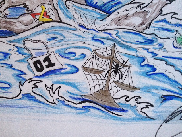
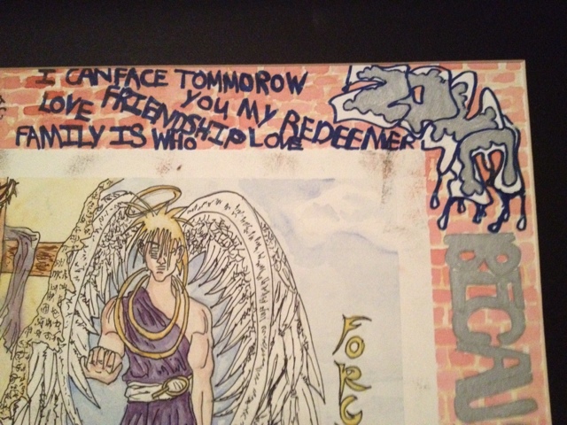
I am going to be posting over the next few months or so little teasers of my comic/graphic novel progress from scrip to toughs to initial pencils, inks, flats, and final colors. I will not be sharing any story details as of yet or any of the pages in sequence as I plan to set up a comic press blog and also put he end result to print. If you would like to know the general story plot email or call me and we can chat. When it comes down to it I am really worried about my ideas being taken or the story being spoiled before it is finished. Sorry! For now I hope you enjoy the teasers
Subscribe to:
Comments (Atom)


